
Page 17 - Floors AZU
P. 17
The design: drawn color forms The colors I have
selected eventually are: in the eastern morning
street, 3 shades blue, lavender and a mint green.
The bent lines are made of aluminium. In the
middle street, high noon, is the darkest blue of
the morning combined with sea green, yellows
and a warmer grey. Here he circles are drawn with
messing strips. The third street has ultramarine
blue but in combination with more reddish violets,
morning, afternoon and evening, Maria van Elk, color plane composition according to the Academic Hospital Utrecht, 1987 – 1989. copper.
whereas the semicircular lines are made of red
The straight color fields are cast directly against
each other. The geometrical forms are the
result of the interaction of two contrasting lines,
straight and bent, that form the composition. The
corresponding basic shapes, square and circle, are
also the formal basic principles of the architecture
of the AZU (Academic Hospital Utrecht): the
dynamic quadrant is the basis of the layout of
space which is apparent from the floor plan. The
circular shape returns in the construction of
the transparent roof, which is also visible in the
sectional drawings.
I am not interested primarily in these geometrical
shapes, but more in the foundations thereof,
straight and bent lines. By the movement of
drawing they cross each other and surround
design; 1986 shapes and areas that are covered with color.
Between floor and roof plays the light, colored
by the day, which I have drawn in materials on
feeling. These are the reflections from the outside,
This concept was greeted with enthusiasm by the the floor by geometrizing of direction, space and
architect and also by my colleagues and everyone they are, actually, aerial landscapes.
choose their own part of the building. From the
beginning I wanted the ground floors as working Color and space The size of the color fields is
area. I wanted to use the daylight that falls on most important, but color is also dependent on the
of the parts of this floor. I choose those spots that material in which it is shown. The moment a color
could be seen from all the 5 storeys downwards, is not an abstract idea in your head anymore
preferring spots of visual concentration over it is fixed to a material. With that also with the
the “all over” pattern of repetition. A clear texture of it. The binders influence the brightness
principle certainly, but not a systematic shift or of a color but on the other hand the direct
When you go and look at it now, you will see that surroundings of the color are also of consequence.
this is by thinking much more functionally. The a repetition of the same element. Cohesion with The “mutual influence” to speak with Josef Albers.
counters are yellow, just to draw the attention of large differences. This design clearly relates to the The ratio (quantity), the material (quality) and
people to the counter. This is completely different architecture, but at the same time turns away from the context (interaction) of the color are the 3
from the way I use color” it completely.
classic problems that I bring to a solution. In this photography Ferry André de la Porte
case for a specific location in cooperation with the
The concept: from light to light Fairly soon I manufacturer of the material and the work men.
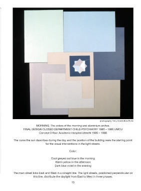
forwarded my proposal to use the 3 phases of the The fourth problem which plays a role primarily MORNING. The colors of the morning and aluminium arches.
day, the morning, the afternoon and the evening in the finished design, but which one has to take
as point of departure. All 3 covered light streets indeed into account, is the changed spatial color FINAL DESIGN CLOSED DEPARTMENT CHILD PSYCHIATRY 1985 – 1986 UMCU
have each a north-south orientation and between experience. When one actually stands on the large Concept 0 floor Academic Hospital Utrecht 1985 – 1986
themselves are arranged from east to west. I have color fields, one is more or less within an abstract
related this spatial orientation of the building color space. The higher in the building the more
components with the orbit of the earth around one experiences the composition as a whole.
the sun. The course of a day from dark to dark The curve the sun describes during the day and the position of the building were the starting point
and from light to light has different color shades for the visual interventions in the light streets.
and has also different color atmosphere. Also, in a
policlinic there are long waiting periods. For years I
have been observing the constant changing colors Color:
of daylight which also changes the tone of things. I
wanted to convert the colors of time into a spatial
organisation in the color streets and materialise
them, Different colors for each light street passing Cool greyed out blue in the morning
from east to west. Different but with cohesion. Warm yellow in the afternoon
Dark blue violet in the evening
The main street links East and West in a straight line. The light streets, positioned perpendicular on
this line, distribute the daylight from East to West in three phases.
15